Code
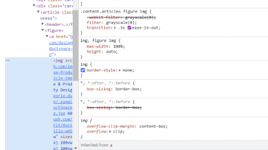
The code was actually very easy they used a grayscale to make the images change color when hovering over the cards to get to the next content and articles. I would have thought it would be more difficult to make it change colors when hovering over but it was very simple.
User Interface - UI
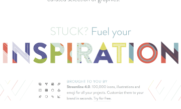
I really liked the design of the site all together, but my favorite part was the bright and pastel colors that were incorporated throughout the site. I thought it was much more visually appealing that the site was more colorful but not too colorful where it was too busy.
User Experience - UX
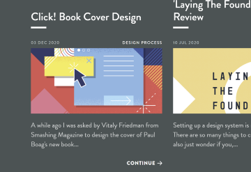
The cards were my favorite part of the user experience because by using the cards they made it much more interesting and instead of clicking an arrow to get to the next page they created the cards which would actually change from the bright colors to a gray monotone look when you hover on the card which was a great way to make going to the next page more interesting.
Summary
I really liked this site, they used a lot of great user User Interface and User Experience techniques to keep the user interested as well as made it user friendly, everything was labeled nicely and was not too crowded so the user was not overwhelmed.