Code
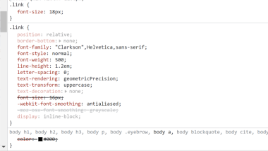
The code was very simple for the card layouts as well as the code for the links. The code for the links included more style aspects to make the User Interface and User Experience the best it could be.
User Interface - UI

I loved the design of the squarspace site, the colors were pastels but also included brighter colors. Using bright and lighter colors made the site very aesthetically pleasing and made me want to keep reading. The images and animations were perfect for the site and they included the perfect amount of color and information to keep me interested.
User Experience - UX

The overall user experience with the site was good. There were several parts on the site I liked which included drop down navigation, hover selectors, and card layouts.
Summary
I really liked this site a lot, they included a lot of information but incoorporated great colors and graphics for the User Interface aspect and included great transitions and hover properties to make the page more interesting in the User Experience.