Code
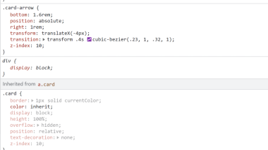
The code for the cards was quite simple. To code the cards they used display:block to make the square around the cards and used position:relative to make the arrow appear at the bottom which also made the read more section pop up. The arrow coding was simple as well, which included a transition- transform and a transform- translate X which made the arrow appear.
User Interface - UI
I liked the design on the cards, the graphics were minimal and the colors were simple however I liked that they designed the cards that way. Including more monotone colors for the cards was the perfect touch, since the rest of the site was bright colors it looked great the way it was.
User Experience - UX

I really liked when I hovered on the cards and a read more option was shown where the date originally was. Adding the hover was a fun way to go to the next page. Instead of the pages being more busy the designer included these small css codes that greatly improved the site.
Summary
This site was a perfect example of how User Experience and User Interface allows the person who is using the site to have a positive view of the site as well as fufilling the users needs. Including both the User Experience and the User Interface makes the site more visually appealing to all users and creators.