Extract UI Items
Navigation Current Page
User Interface Discussion
Having the arrow included made the page seem more free flowing as it went from talking about GitHub pages to having the arrow pointing down to the clickable icon. Instead of saving click the link below the Jekyll website used an icon of an arrow to tell the user to click the Github link.
In order to create the arrow they used a free hosting pane with a minimum width of 768px to keep the arrow in a given area. Also in the css code they used the background image of a arrow with a certain width and height to make the arrow be the size and shape they wanted it to be, additionally the css contained the position property and and right & bottom properties.
Navigation Current Page
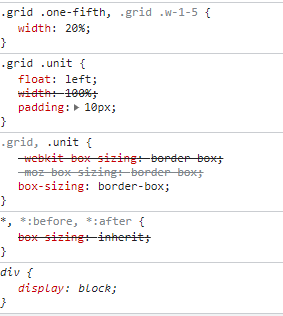
User Interface Discussion
I like having the option to have a side navigation on both sides rather than only on one side. Having a side navigationon both sides make the appearance of the screen much more organized space for the users.
To create the side navigation in the CSS file they used a grid unit and had it float left as well as create 10px for padding. For each individual unit there was also a property labeled .grid, .unit which had a box sizing attribute labeled border box.
Navigation Current Page
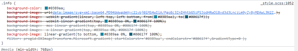
User Interface Discussion
The information banner was a great way to include important information across, and instead of having another paragraph or collumns like the information above is laid out. The informational banner made it stand out more and created a statement on the page.
In order to create the information banner the CSS file contained a negative margin value of -50,left and created a linear gradient on the banner to make it stand out more. With the min-width set at 768px it made the banner also not take up the entire screen and wrapper which was also what made it jump out more to me as a user of the site.
Navigation Current Page
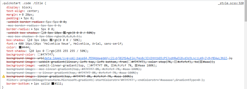
User Interface Discussion
The quick start box was a great way to capture the users attention. The way Jekyll used a box and created a box shadow,a text shadow and multiple different text colors. Including all of these different css properties made the page look much more aesthetically pleasing.
To create the quick start box in the CSS file a block disply with a padding of 5px and a margin of 20px. Also in the CSS file a box shadow of 0 3px 10px, and a border-radius of 5px 5px 0 0;. The last part of the CSS file was a text shadow of 0 1px 0 rgb(255 255 255 / 50%). By including all of these different properties it made the box stand out to the viewer as well as match the colors of the rest of the page.